The Biggest Design Update Since iGPA Went Live
iGPA’s biggest redesign since launch — a cleaner, team-ready workspace, refined mobile, guided walkthroughs, and a richer tagging system for international admissions.
An all-new design built for performance and reliability.
iGPA has always been built to turn each GPA conversion into something that compounds — insight about a student, a school, a territory. This release doesn't change that idea; it makes it easier to work with and easier to share across a team. We redesigned the workspace for better usability, brought different teams under one roof for Institution accounts, and expanded how you tag and read your data.
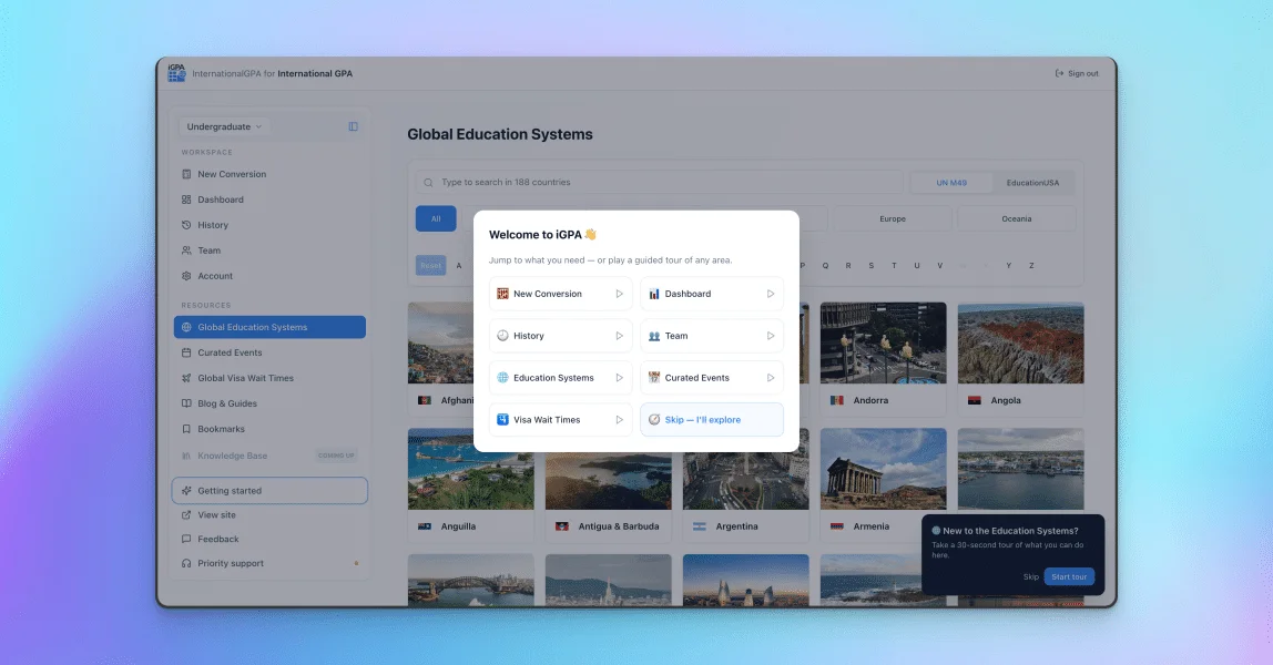
A cleaner workspace, built for teams
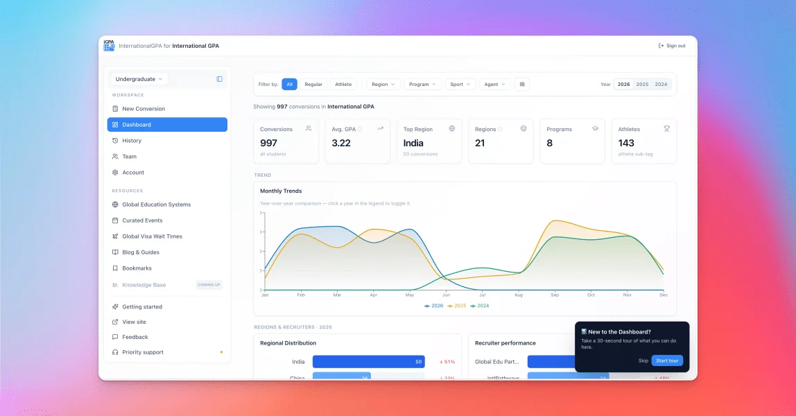
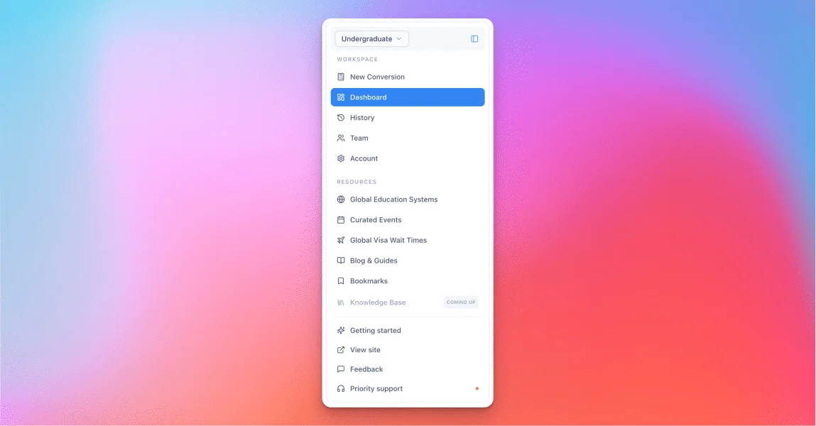
We rebuilt the workspace around a single, persistent sidebar, so every function has an obvious home and you spend less time hunting for the one you need — the redesign is purely about usability. The Calculator is now New Conversion, a small rename that better reflects what the tool is built around: converting a GPA into a usable record.
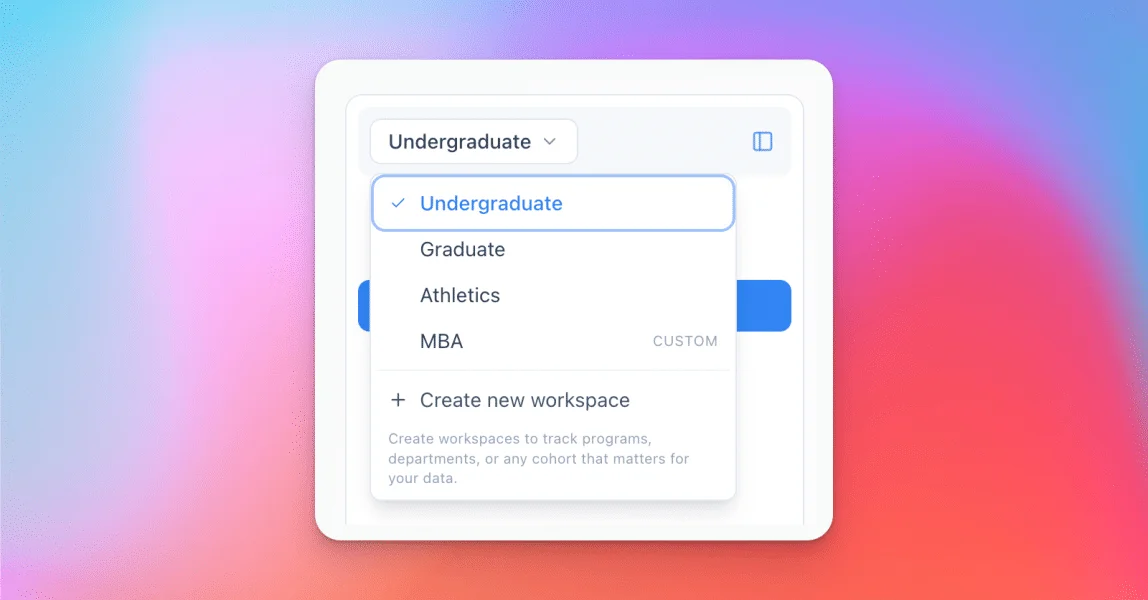
For Institution-tier accounts, the bigger change is underneath. Different teams can now work side by side under one institution, each scoped by the workspace selector at the top — so a graduate team, an athletics desk, and an undergraduate office can share the platform without stepping on each other's data.
A cleaner experience on mobile
The upgrade isn't only for desktop. We reworked the mobile view across the workspace so it's cleaner, easier to reach what you need, and more reliable on a phone or tablet — whether you're checking a conversion between meetings or pulling a recruiter's numbers on the road. Less clutter, fewer mis-taps, and the same data you trust on the big screen.
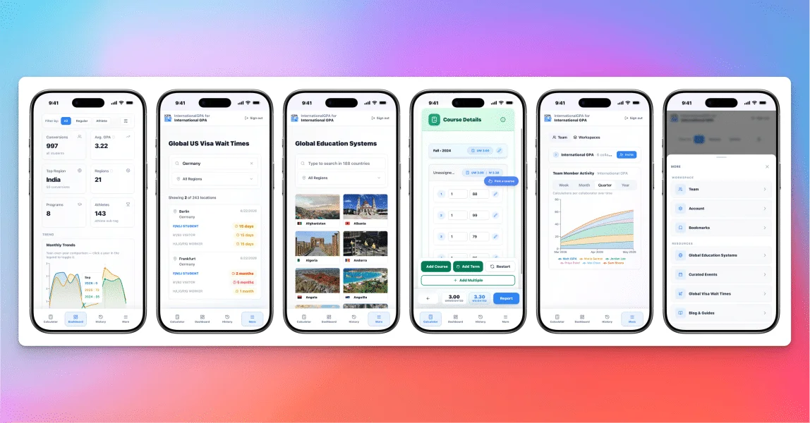
Guided walkthroughs, on your terms
New to a section? On desktop, each area now has a short, optional walkthrough that points at the actual buttons on the page and explains what they do — New Conversion, Dashboard, History, Team, and the territory tools (Education Systems, country profiles, Curated Events, and Visa Wait Times). They're skippable, they never trap you in a funnel, and you can replay any of them anytime from Getting started — each card shows ▶ to take a tour or ↻ to run it again. Take the one you need, ignore the rest.
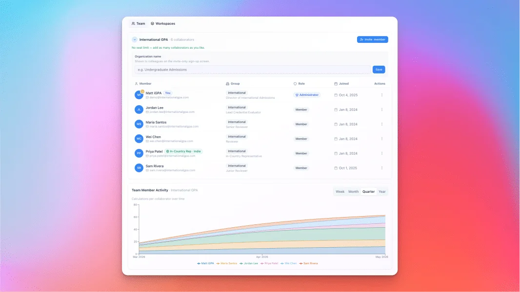
Team labels, including in-country reps
You can now label teammates by role and affiliation — including in-country representatives tied to the regions they cover. For an admissions head, that turns the Team view into more than a roster. Paired with Team Activity, you can see how your overseas colleagues are performing, when their work peaks and when it goes quiet, and step in at the right moment. When a rep's busy season hits, you'll see it — and you can provide support and plan around it sensibly, instead of guessing from a distance.
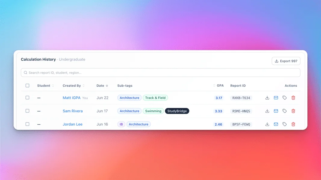
Sub-tags that turn conversions into a map
Every conversion can now carry sub-tags — program, sport, and recruiter — and you can group cohorts into custom workspaces. These aren't labels for their own sake: they feed the Dashboard's regional and recruiter views, the History filters, and your Team's activity picture. Tagged something wrong, or want to enrich older records? Edit tags after the fact, one row at a time or in bulk. A year in, that's the difference between a list of conversions and a clear map of where your class actually comes from.
In short
None of this changes what iGPA is for. It makes the work faster to find, easier to share across a team, and clearer to read back — so the value you were already building keeps compounding, with less friction in the way.